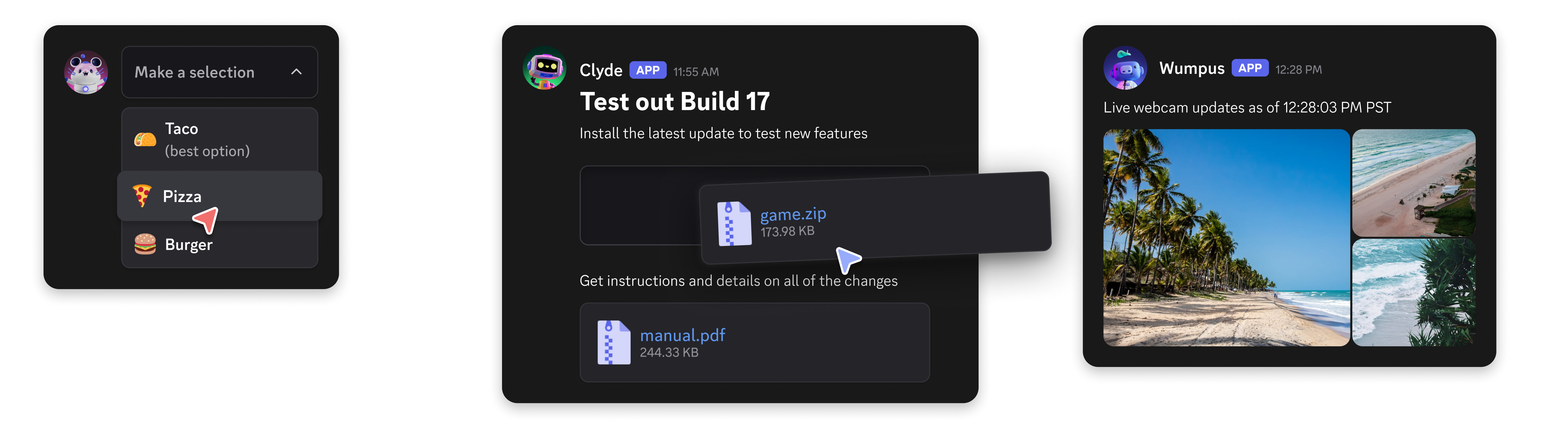
- Layout Components: These components are used to organize and structure the content of your message. They help create a visually appealing and user-friendly layout.
- Content Components: These components are used to display information and content in your message. They can include text, images, and other media.
- Interactive Components: These components allow users to interact with your message. They can include buttons, select menus, and other interactive elements.
IS_COMPONENTS_V2 flag (1<<15). Note that using this flag disables traditional content and embeds - all content must be sent as components instead.
Legacy message component behavior will not be deprecated and will continue to be available to your apps on a message-by-message basis. However, we recommend using the new components for new projects and features.
Using Message Components
A guide on sending Message Components with examples.
Using Modal Components
A guide on sending Modal Components with examples.
Component Reference
Explore the Components reference documentation.
Get Help & Join the Community
Do you have a question or want to connect with other app developers?- Join our DDevs Discord Server and get help from the community, share best practices, and discover new ways to enhance your apps.